Evolux
intro
Evolux is a skincare distributor operating in both B2B and B2C markets. They represent high-performance cosmetic brands Jean d’Arcel and KLAPP, offering expert skincare backed by science.
project overview
client
evolux
category
beauty
year
2025
solution
the intense brand™
services
vibe-driven™ strategy, visual identity, social media, ugc, influencer marketing, ppc
target market
czech republic, slovakia


The challenge
The client was ready to grow. Fast. But juggling two external skincare brands without a unifying identity created more noise than clarity. No ownership. No system. Just chaos & poor results.

the solution
So we hit reset. Instead of pushing borrowed stories, we built a brand the client truly owns—Evolux. It became the brand that brings everything together. Jean d’Arcel and KLAPP now speak with one voice. One strategy. And now Evolux is ready to scale with strong foundations in place.
service 1
vibe-driven™ strategy
We knew Evolux couldn’t be just another skincare brand. The market was filled with lookalike products chasing trends and attention. We chose the opposite route.
Evolux became the calm in the noise. A structured, professional presence that bridges conscious customers and beauty professionals.
Evolux became the calm in the noise. A structured, professional presence that bridges conscious customers and beauty professionals.

tone of voice
When we explored the market, one thing was clear: most brands shouted. Too many promises. Too much noise. Evolux was built to do the opposite.
To hold space, not chase attention. It speaks with quiet authority. Expert, not cold. Human, not vague. A brand that doesn’t try to impress. It earns trust by being still.
To hold space, not chase attention. It speaks with quiet authority. Expert, not cold. Human, not vague. A brand that doesn’t try to impress. It earns trust by being still.
brand vibe
Evolux moves quietly. But with certainty. It creates space instead of noise. Every touchpoint is designed to feel calm, intentional, and grounded.
Soft, but not weak. Expert, but never cold. Aesthetic, but free of excess. Visuals and voice flow in the same rhythm.
Natural, unrushed, and deeply human. Evolux isn’t here to impress. It’s here to stay. A pause in a world that rarely stops.
Soft, but not weak. Expert, but never cold. Aesthetic, but free of excess. Visuals and voice flow in the same rhythm.
Natural, unrushed, and deeply human. Evolux isn’t here to impress. It’s here to stay. A pause in a world that rarely stops.
competitor analysis
We conducted an in-depth audit of both retail and professional skincare brands. The market was noisy, trend-driven, and overly styled.
Exolux was designed with structure, depth, and a clear visual language. Not a passing trend, but a brand meant to endure.
Exolux was designed with structure, depth, and a clear visual language. Not a passing trend, but a brand meant to endure.
persona analysis
While mapping the audience, two distinct voices emerged. The first, a customer tired of empty claims, craving honesty and simplicity in skincare.
The second, a beauty professional demanding structure, consistency, and proven outcomes. Instead of choosing one, we built a brand fluent in both.
Speaking clearly to everyday needs while standing firm in expertise.
The second, a beauty professional demanding structure, consistency, and proven outcomes. Instead of choosing one, we built a brand fluent in both.
Speaking clearly to everyday needs while standing firm in expertise.

service 2
visual identity
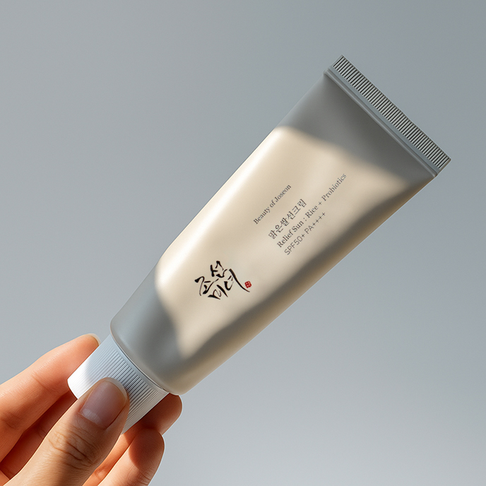
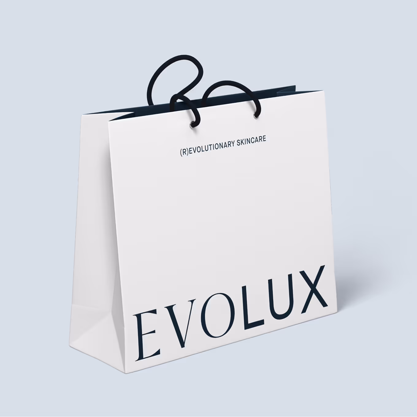
logo
A smart blend of serif and sans serif. Science and intuition in one. Bold yet soft. Structured yet open.
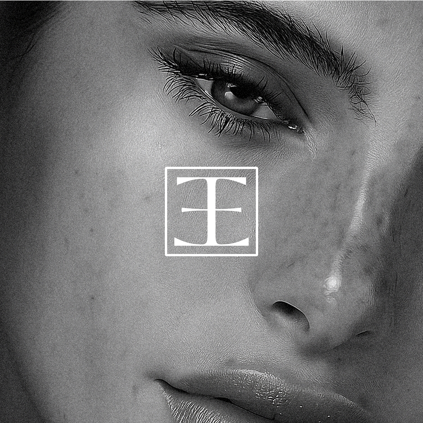
logosymbol
A mirrored letter “E”. Clean, subtle, and intentional. It embodies the brand’s core duality: intellect and intuition, precision and empathy. A quiet symbol of balance and purposeful beauty.


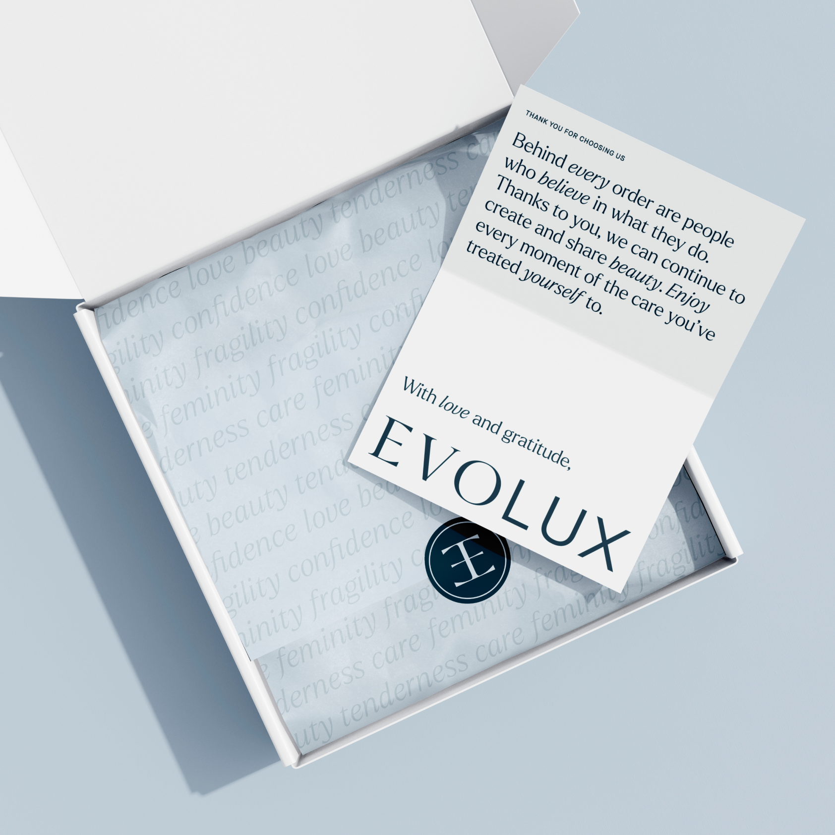
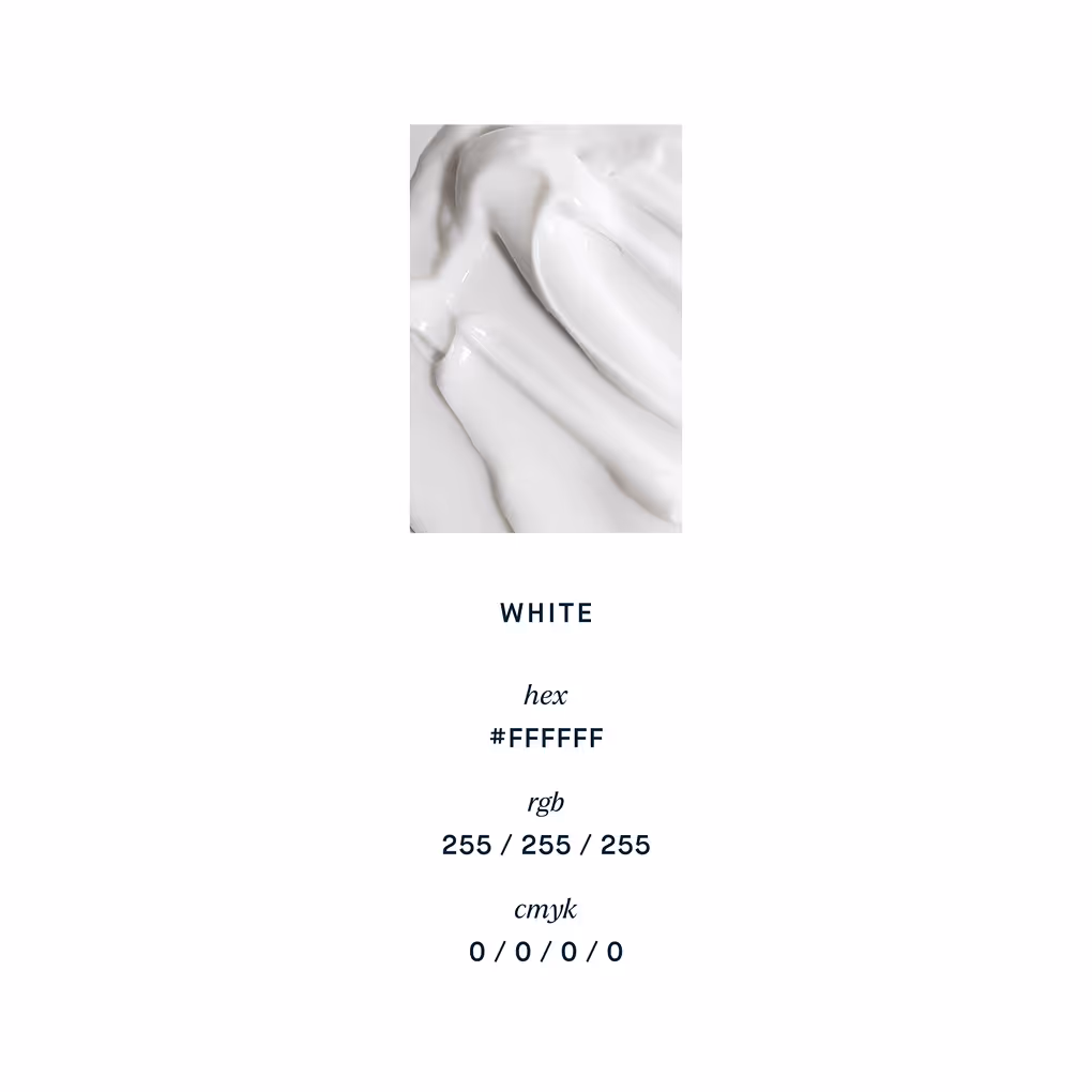
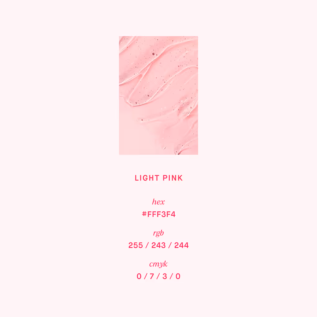
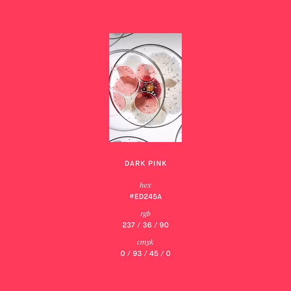
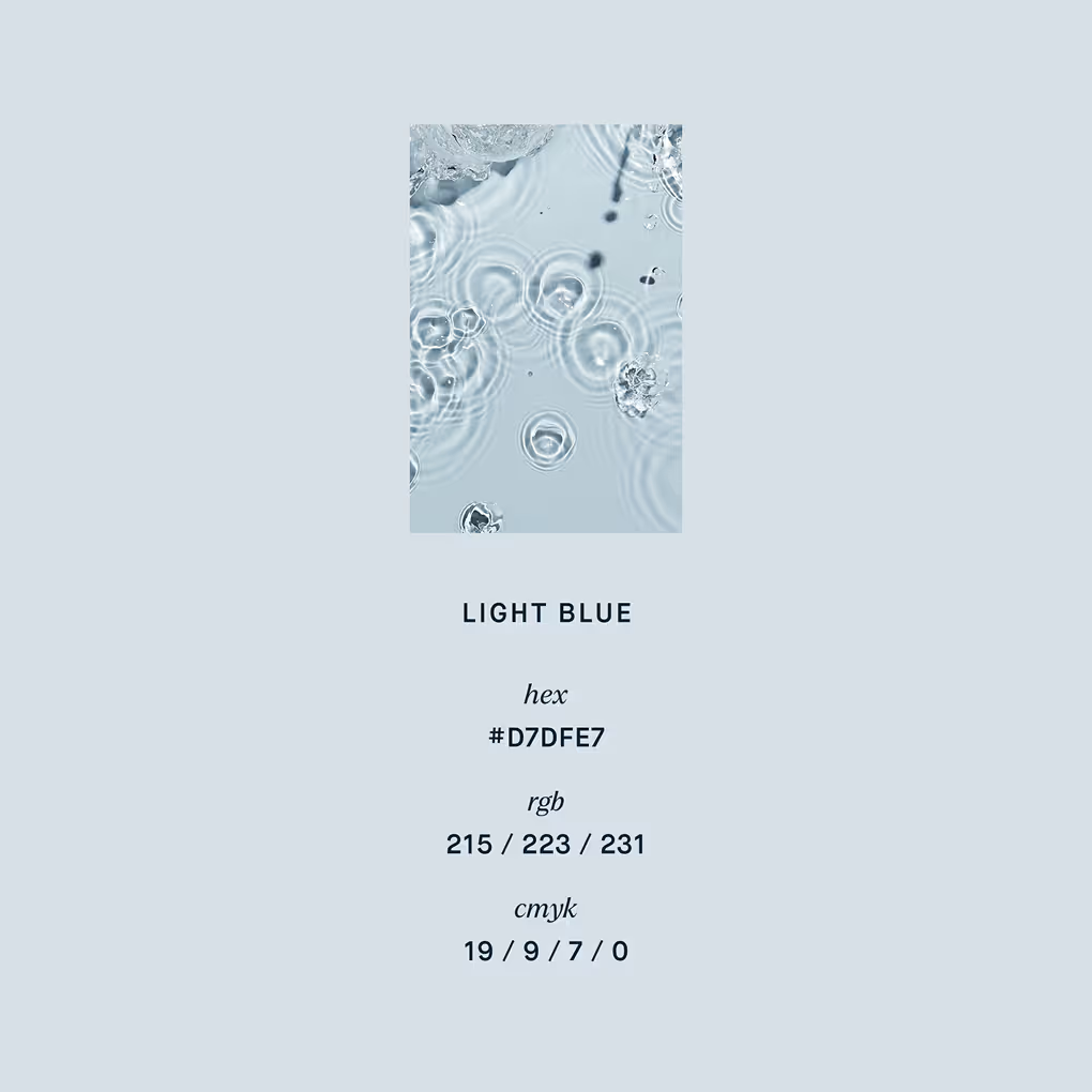
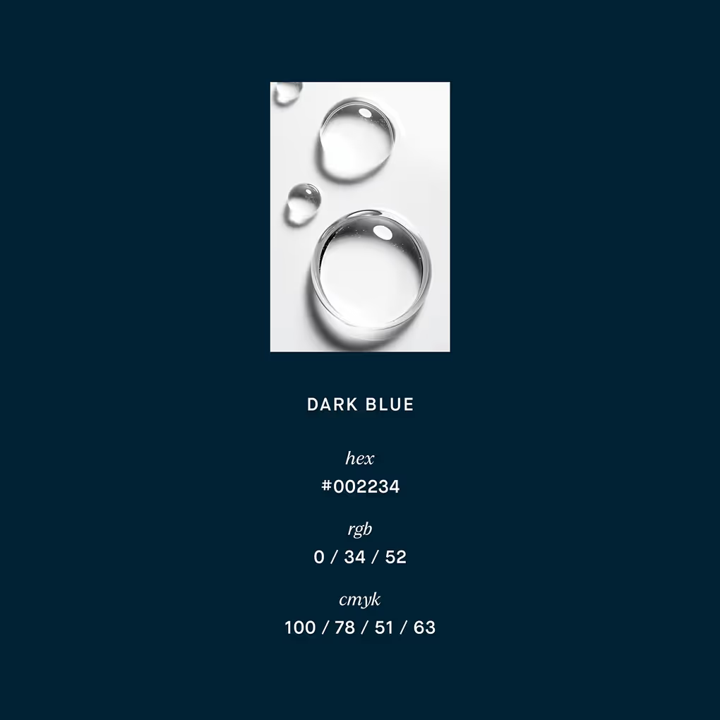
color curation
We created a palette that makes you pause and breathe. White, soft grey and pastel blue bring clarity. We chose deep navy over black.
For depth that feels softer. Bold enough to anchor, gentle enough to breathe. A visual language that calms. Just like the brand.
For depth that feels softer. Bold enough to anchor, gentle enough to breathe. A visual language that calms. Just like the brand.

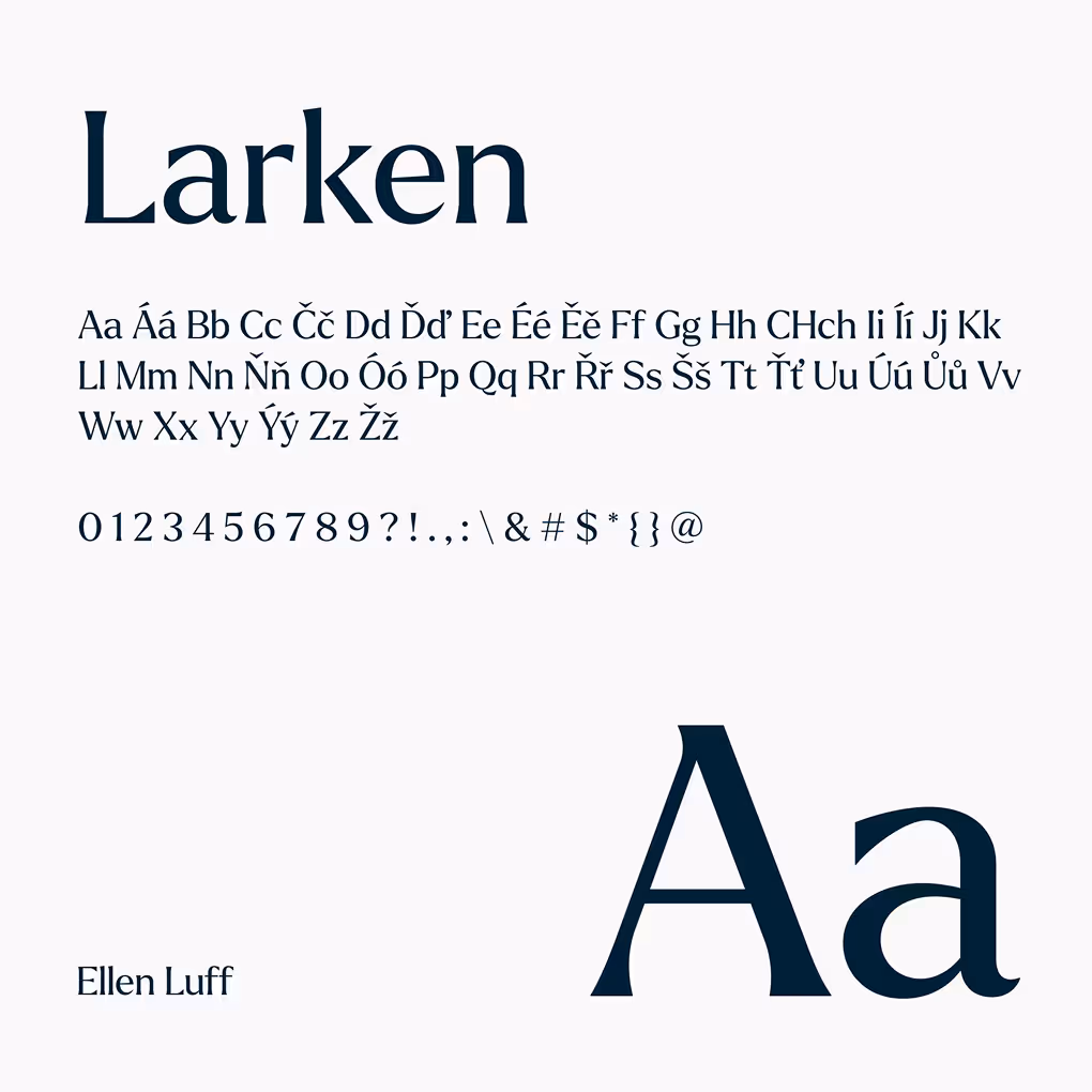
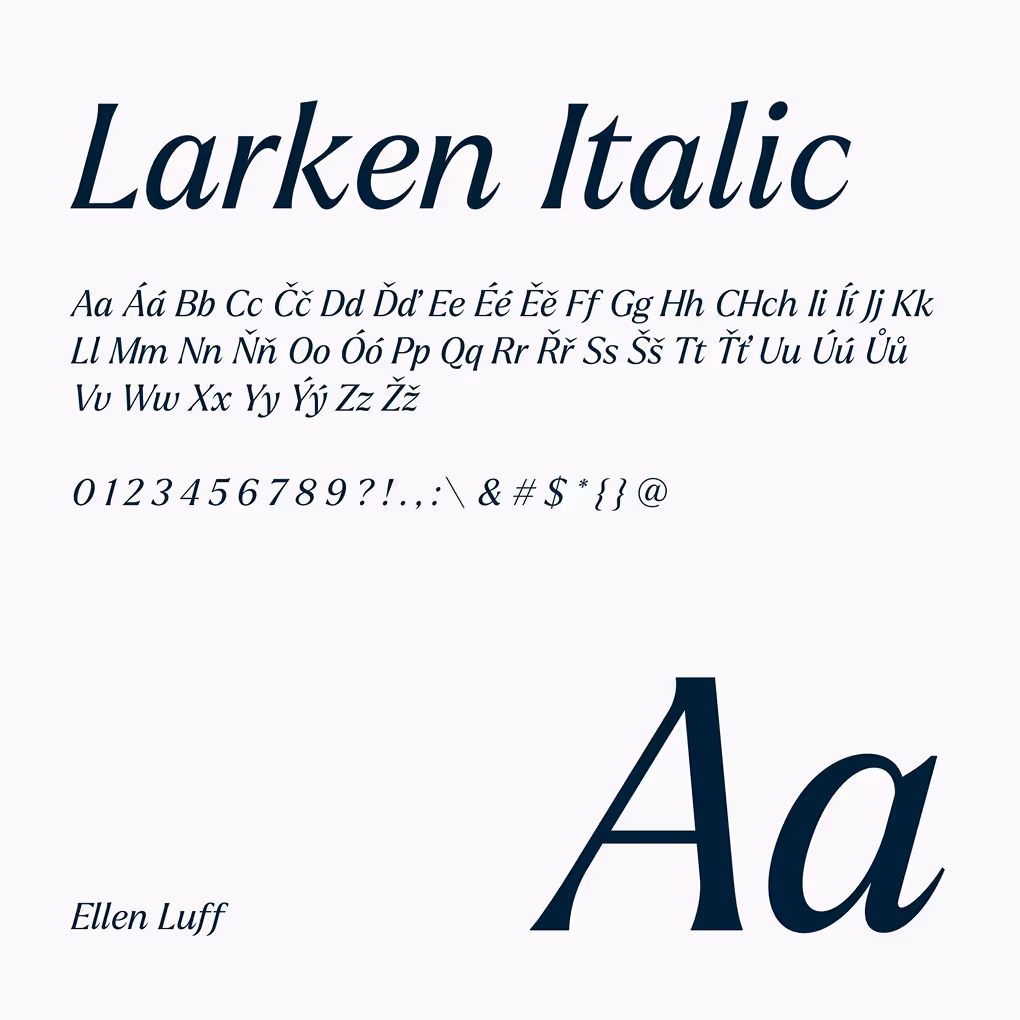
typography suite
A balanced mix of sans and serif. High legibility, curated by type foundries. Modern, airy, professional. Each font chosen to slow things down and give clarity.

webdesign
We built a space Evolux customers connect with. A site that feels like a conversation. Clean navigation, tactile textures, and a calm rhythm that reflects her pace, her needs, her standards.
service 3
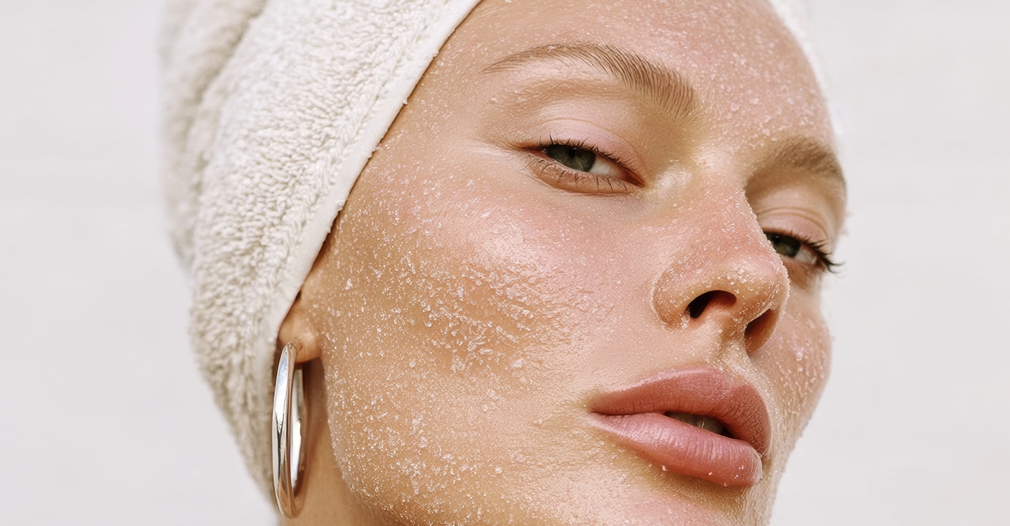
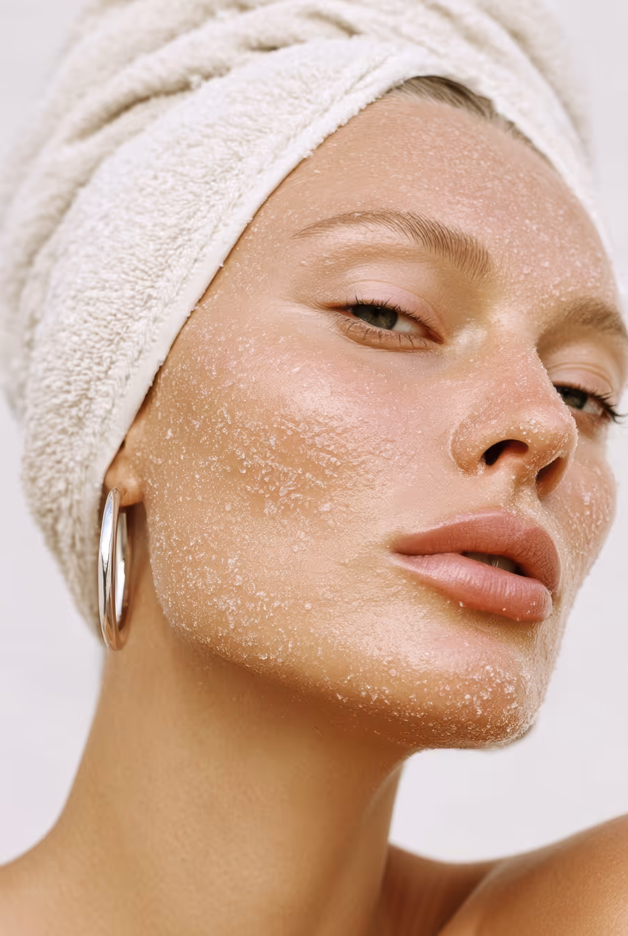
social media
Slow content that sells through trust. Skincare rituals, product logic, expert insights. Clear, grounded, and easy toact on.


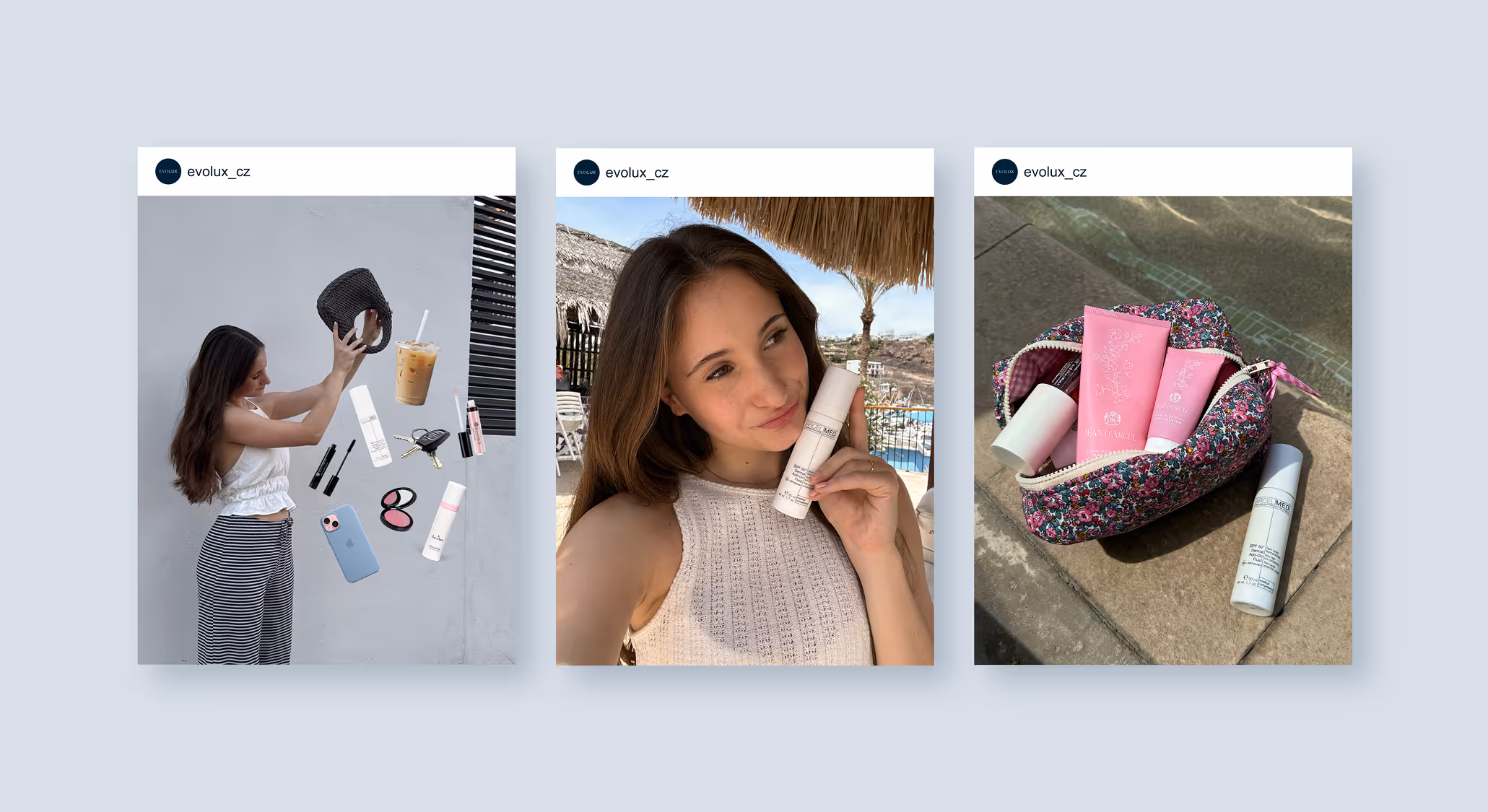
user generated content
Everyday moments. Gentle touchpoints that feel personal. Not promotional. A way to stay present without shouting.

the resultS
We successfully united two brands under one cohesive visual identity. This transformation not only helped our client boost awareness of her brand but also established a consistent presence across all communication channels.
Through engaging content and targeted campaigns, we educated the public on skincare, empowering people to better understand their skin’s needs and make informed choices.
Through engaging content and targeted campaigns, we educated the public on skincare, empowering people to better understand their skin’s needs and make informed choices.
the performance
+52 %
Brand Awareness
7.3 %
Engagement Rate
+32 %
Conversions
21 K
Campaign Reach
testimonial
“Thanks to Intense Social, we gained a clear strategy, strong visuals, and above all a tone of voice that truly reflects our philosophy – all within a few months. We value how they genuinely listen, think in context, and deliver solutions that make sense not just on paper but also in real life. We enjoy the collaboration, and most importantly, it finally brings real results.”